


Friends That Invest is normalising wealth building to help more people see themselves in money.
We partnered with the team at Friends That Invest to define the next chapter of their brand—one that reflects the true scale of their impact and sets them up for future growth and ambitions.
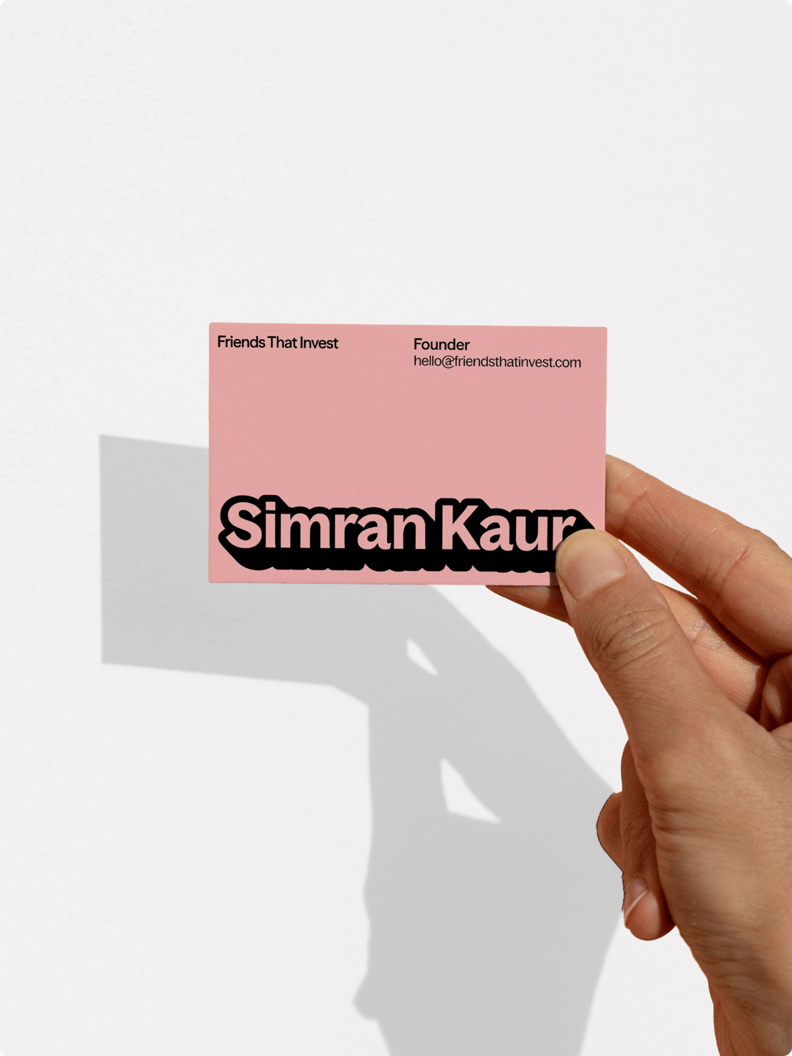
When founder Simran Kaur came to us, it was clear she was leading something far bigger than an investing masterclass, a best-selling book, or even her fiercely loyal global community. Friends That Invest is doing more than educating people about finance—they’re creating an entirely new path to access. By stripping out the jargon and making money talk feel easy, social, fun, and inclusive, they’re changing the way young women engage with investing and building wealth.
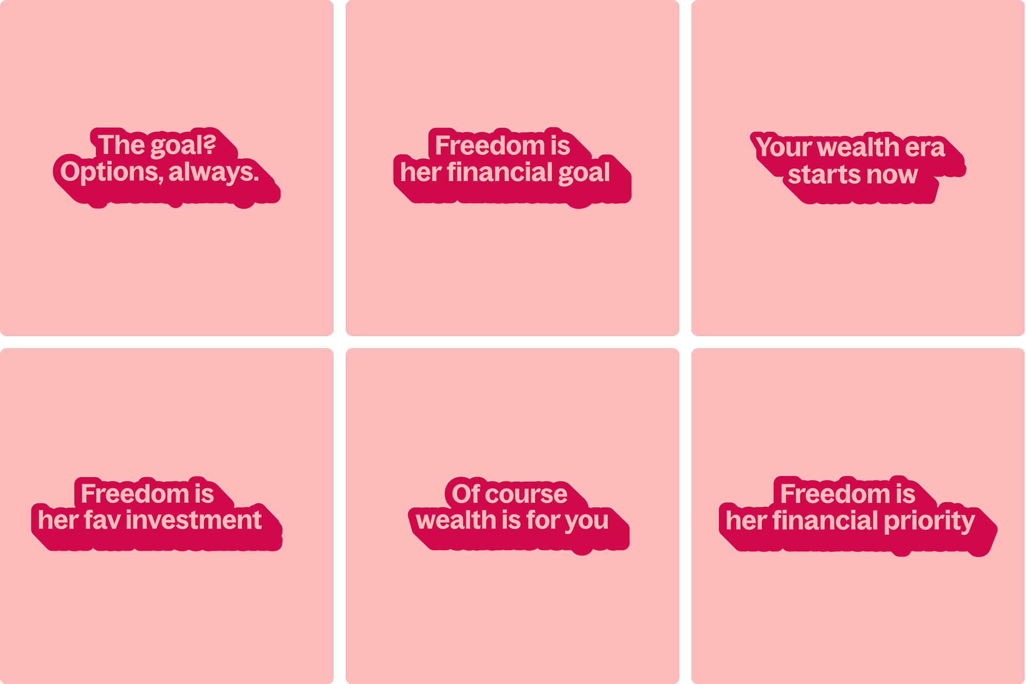
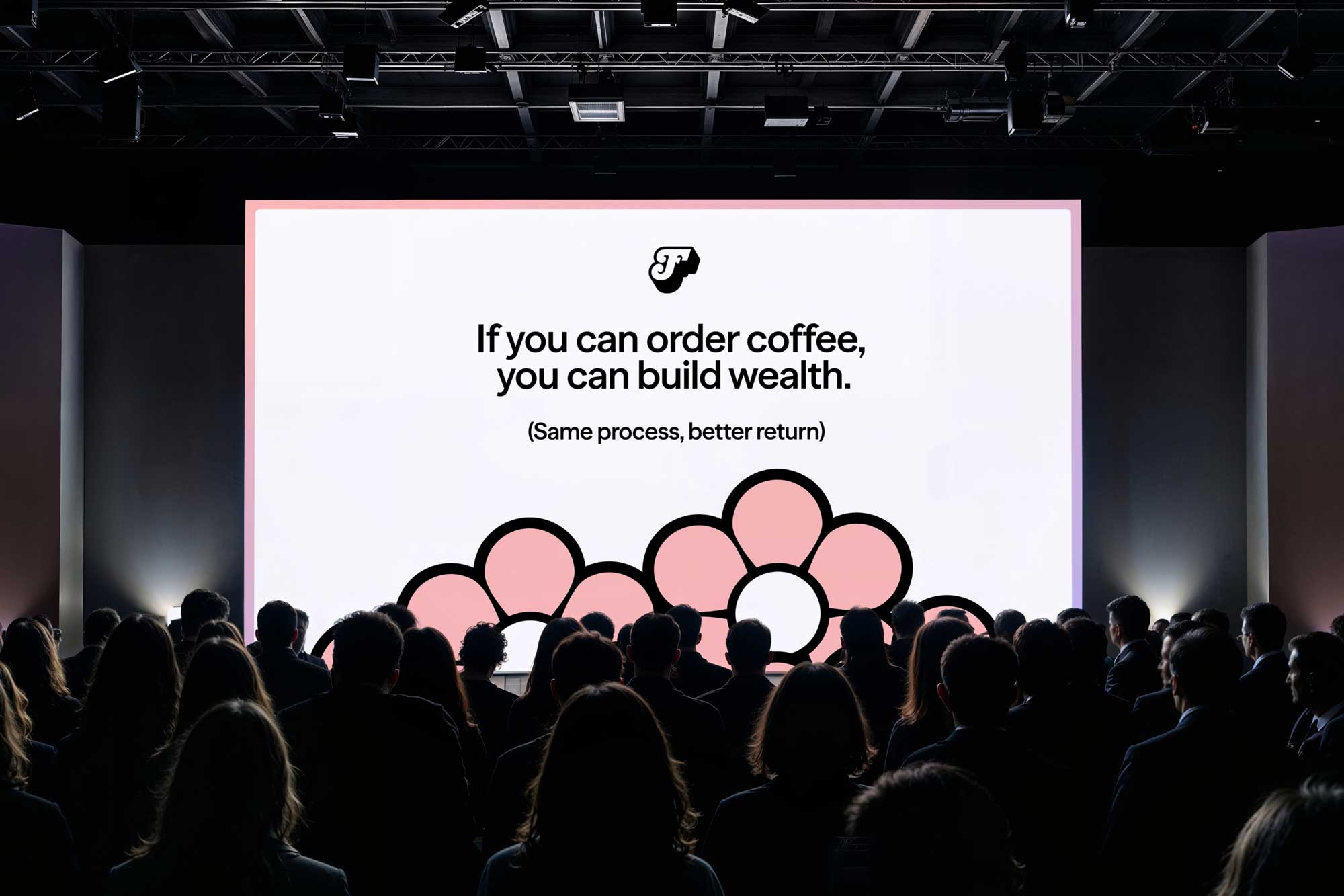
At the core of Friends That Invest is the belief that wealth building can—and should—feel second nature to everyone. Our brand idea, ‘Fluent in finance’, is centred on this posture: a stance that’s confident and unapologetic, and makes investing feel as normal and intuitive as managing your daily life. It allowed us to retain the community charm and girly-pop vibe FTI is so well known for, while bringing a new maturity that reflects where the business is headed and anchoring future product growth with a clear centre of gravity.

The brand identity embraces femininity, being intelligent = simplicity, and the strength of community.
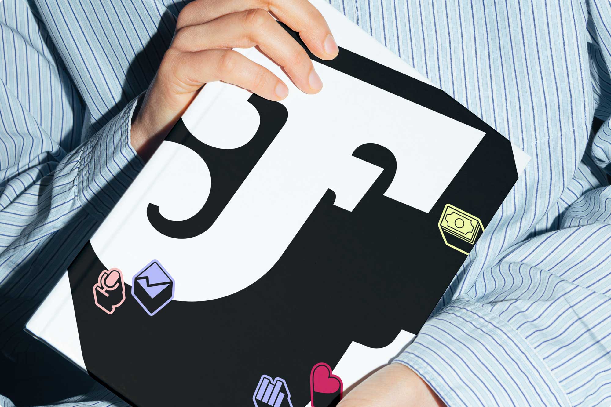
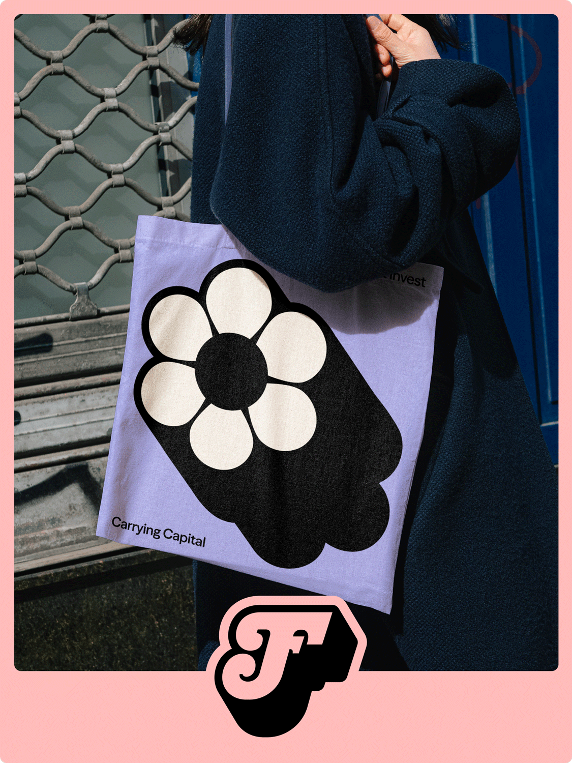
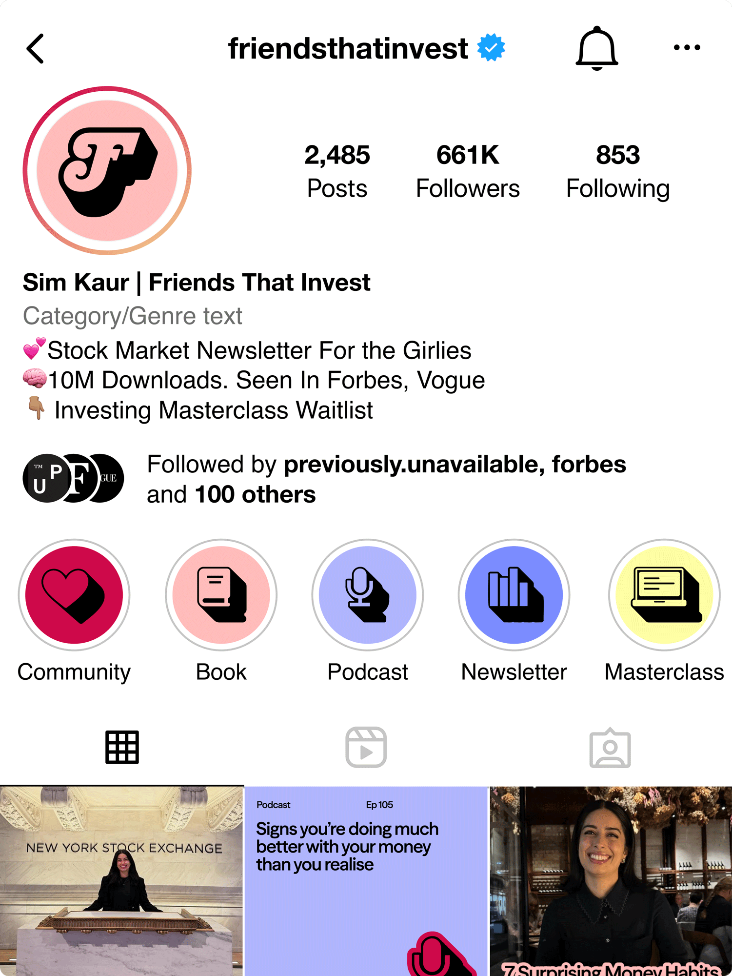
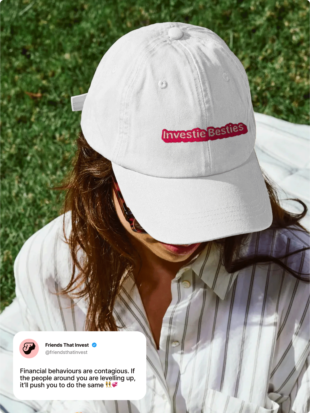
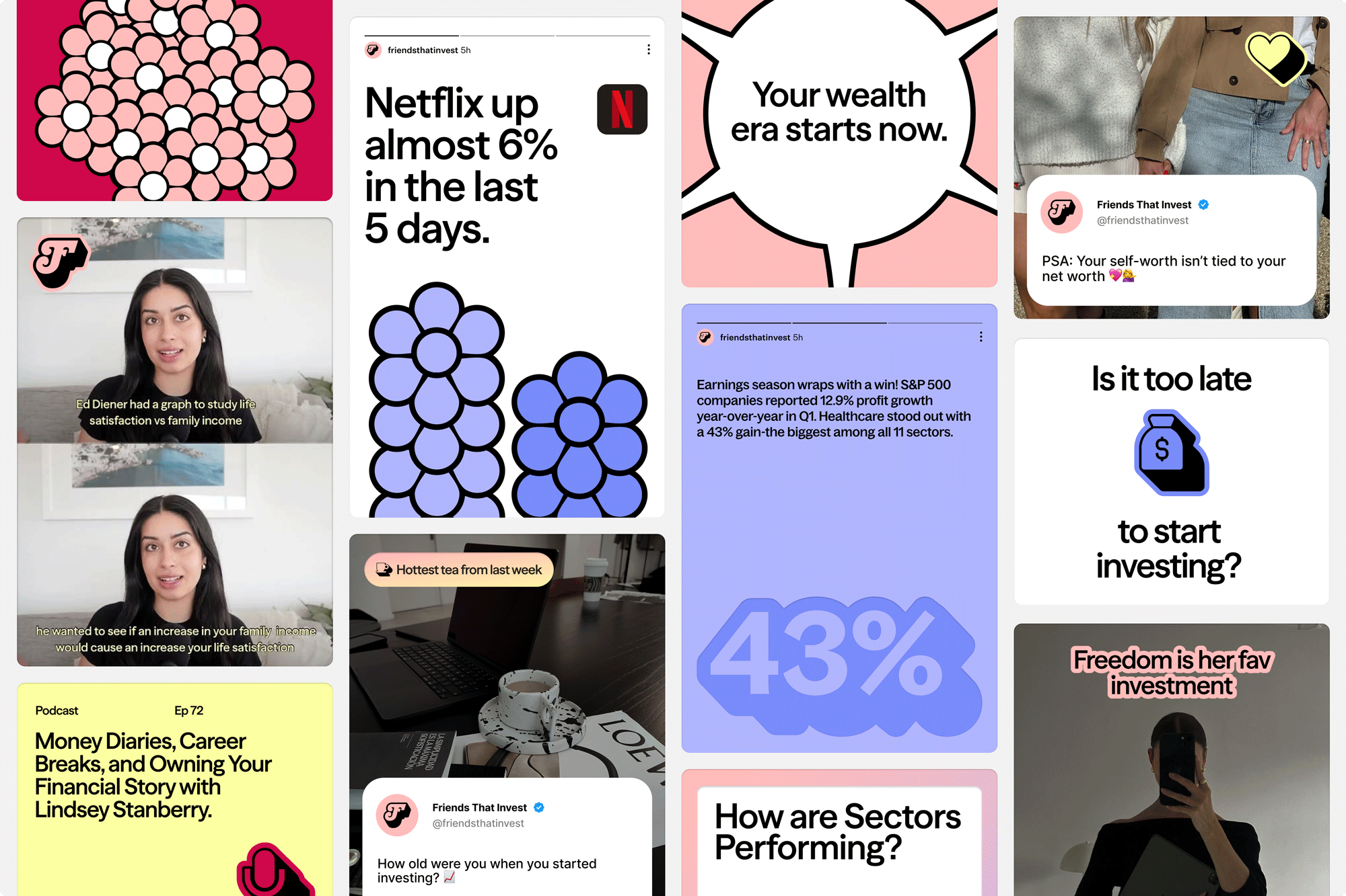
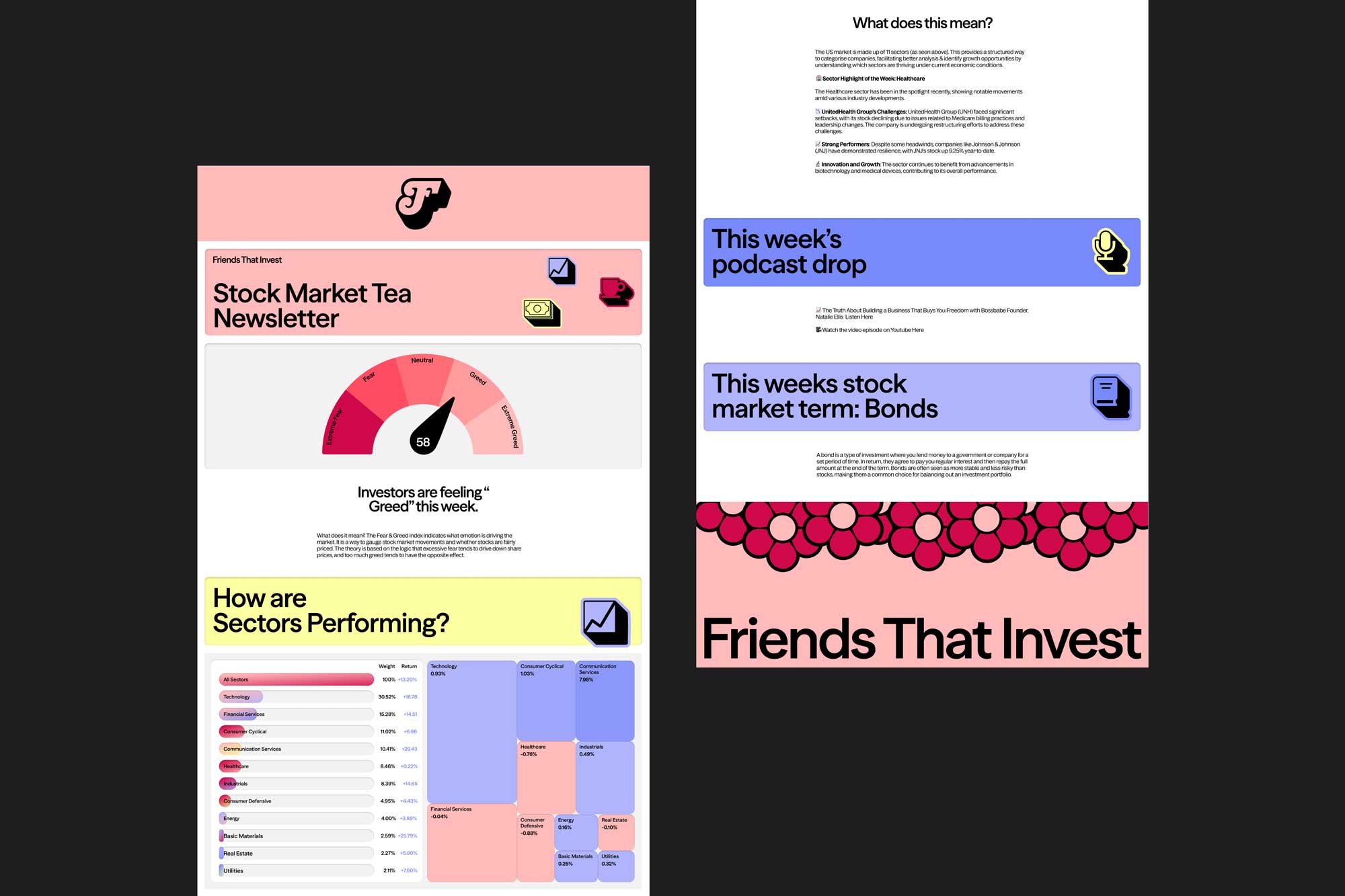
Our graphic language is based on the daisy chain — a true representation of the Friends that Invest community of “Investie Besties” growing together and becoming financially fluent. Our ‘F’ logo mark carries an unapologetically bold yet feminine aesthetic. The stylised compounded nature of the shape speaks to growth and momentum — we’re always facing forward with confidence and glowing up towards financial independence. This compounded effect extends across the identity, enabling confidence to come through in every touchpoint, from hero copy lines to iconography. The colour palette amplifies this energy with hues of pinks, purples, and yellows that balance ultra-femininity with sophistication, giving the brand both warmth and flexibility.
What started as Simran sharing her investing journey to help others, has grown into a global movement — redefining how people relate to wealth and everything that comes with it. Evolving the brand meant keeping the original magic, while giving it the clarity and confidence to carry what’s next.
Sign up for innovation and design news:


.gif)


