


Supa Energy started with a big belief: power should empower. In a time of climate crisis and soaring energy costs, we saw a chance to flip the script. Traditional retailers just sell the same old electrons. Supa builds something better: new solar supply, lower bills and direct support for communities.
The Why
We set out to:
Built on real community needs - struggling school budgets, clubs losing funding, and a hunger for local control - Supa is storytelling backed by action. Classrooms powered. Clubs funded. Lights kept on during blackouts. This is energy that doesn’t just flow - it lifts.
The Idea
Our big idea: Bringing More Good Energy.
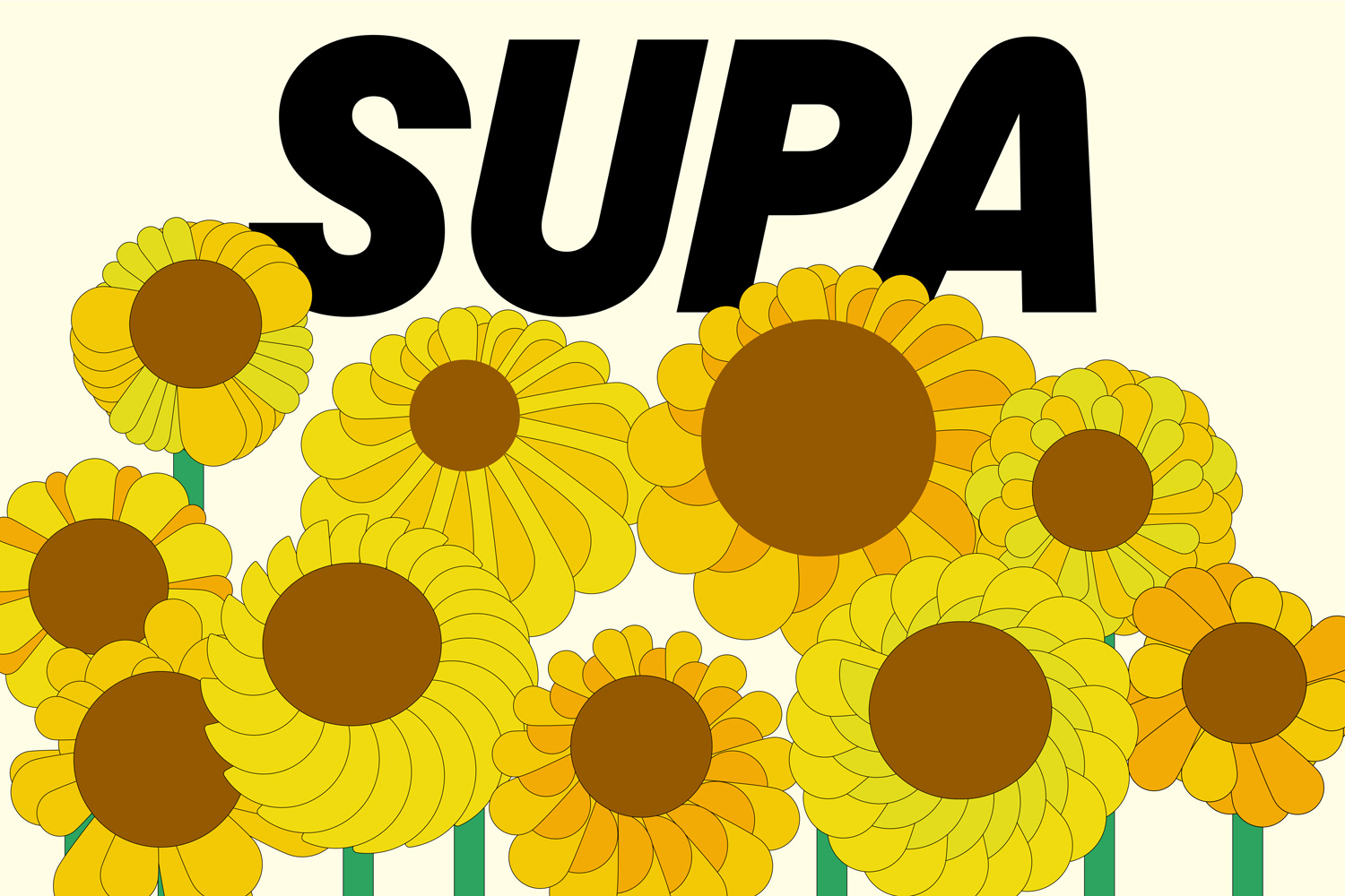
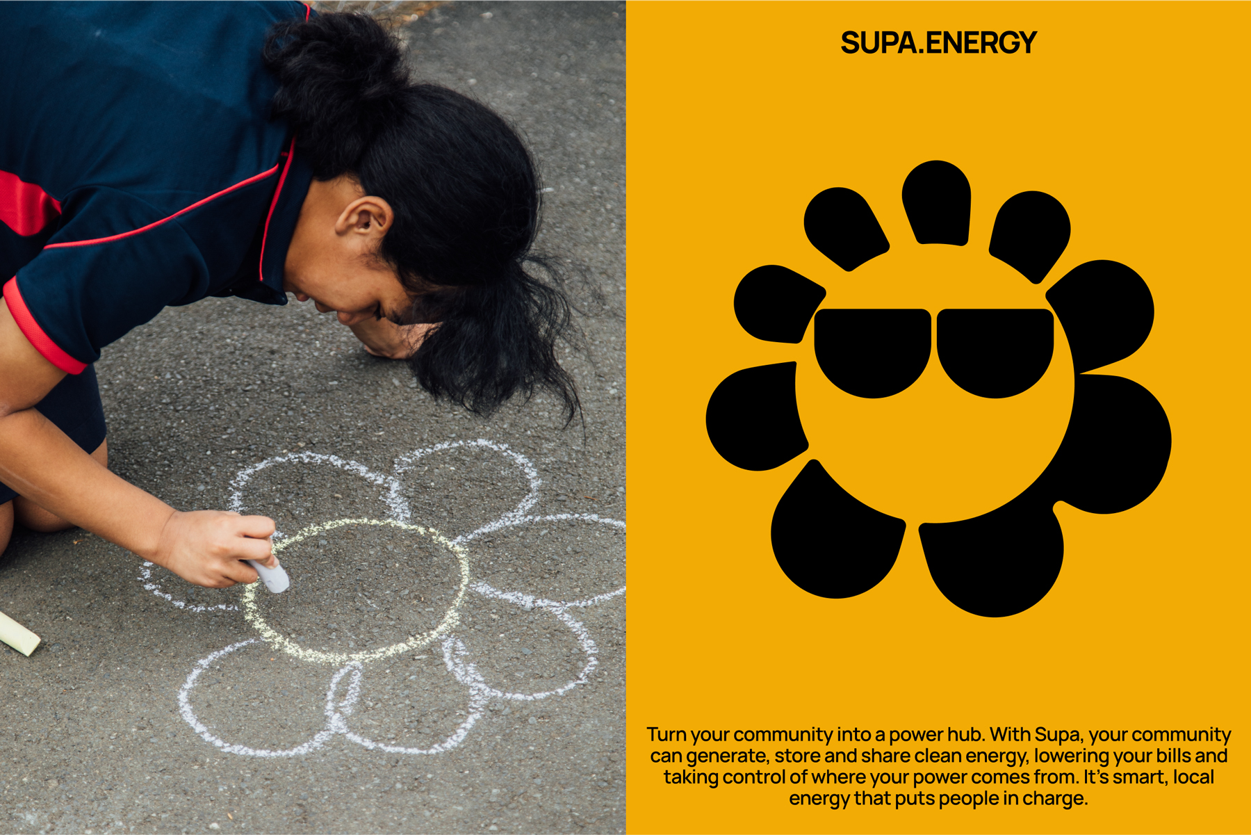
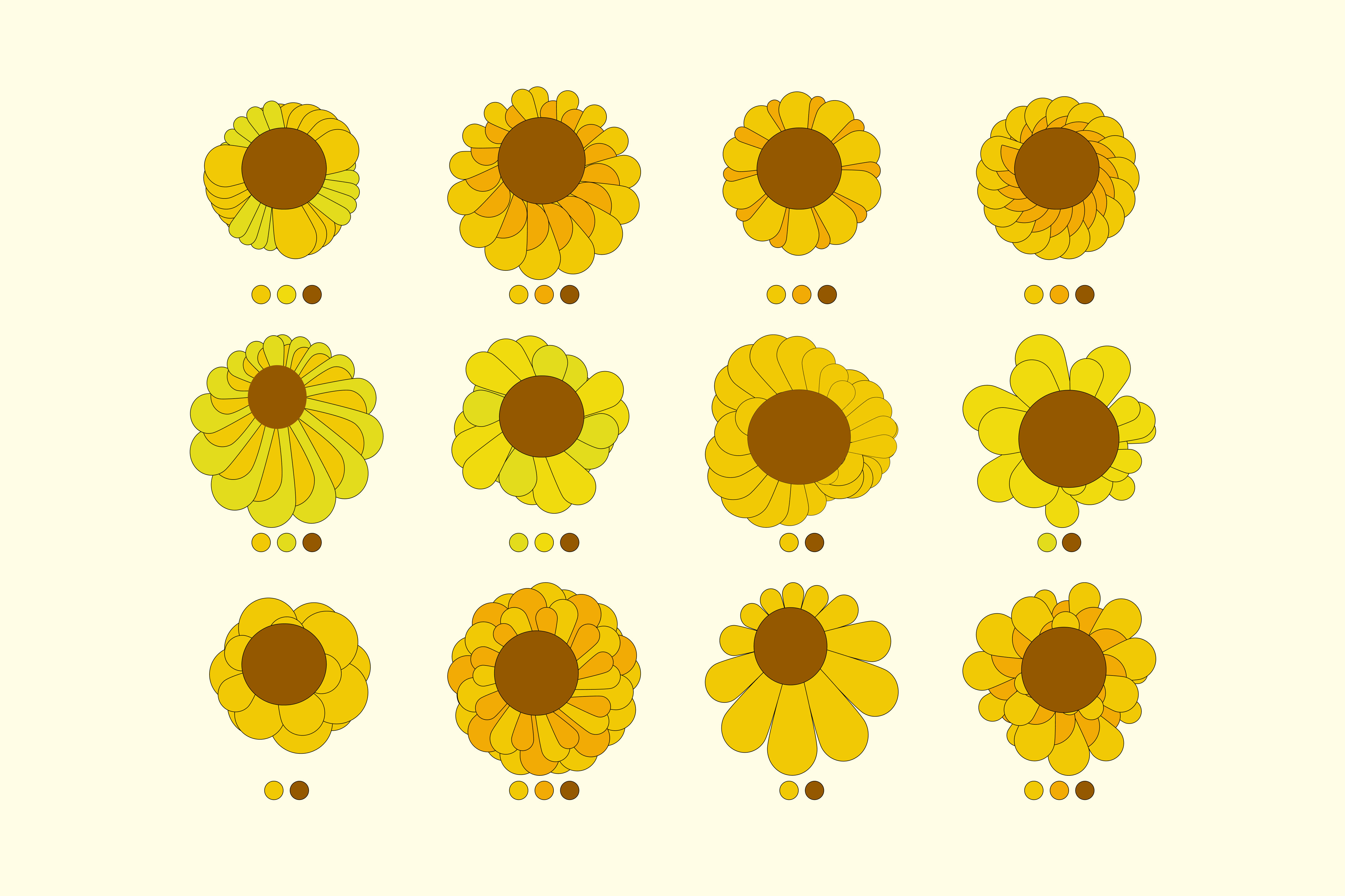
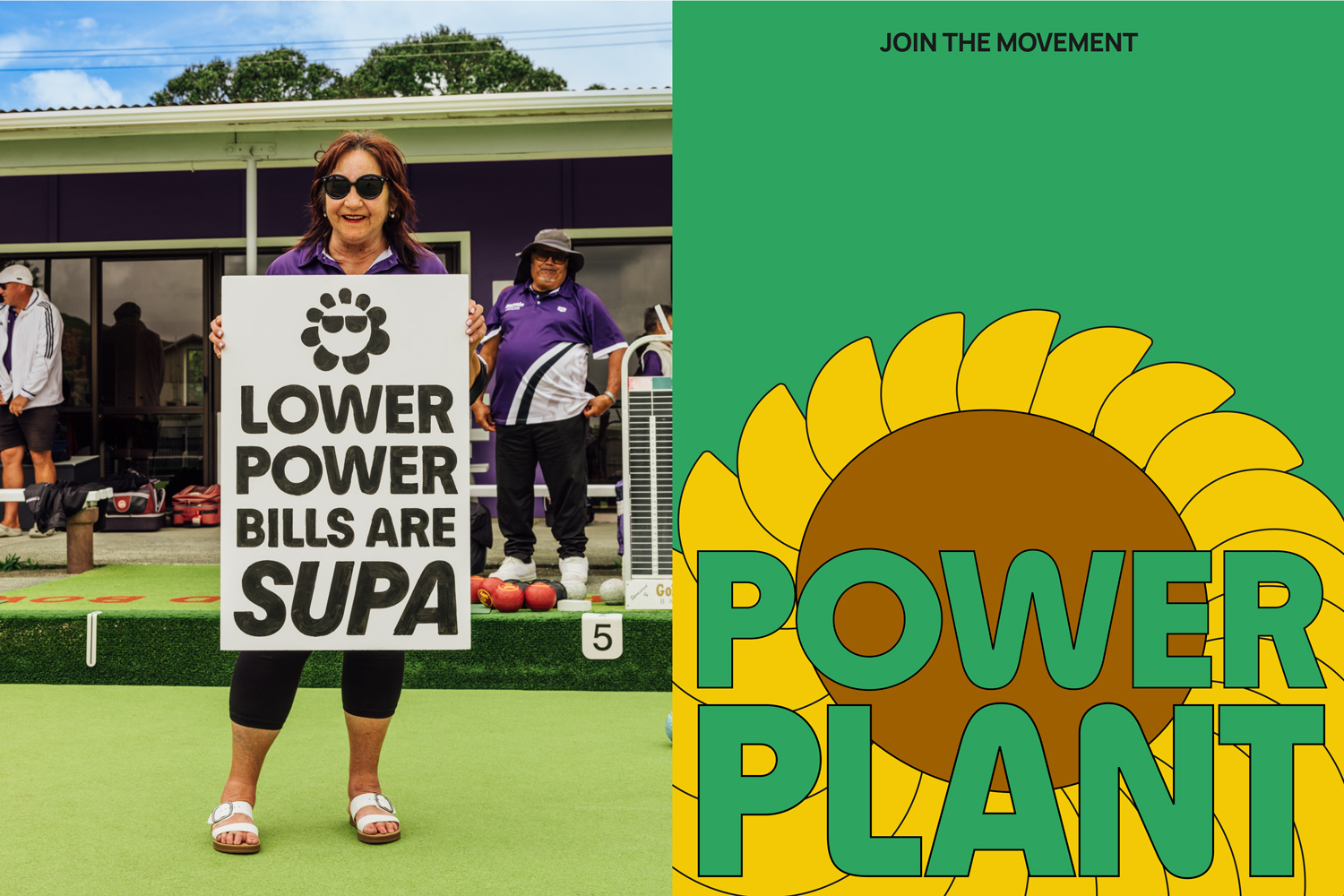
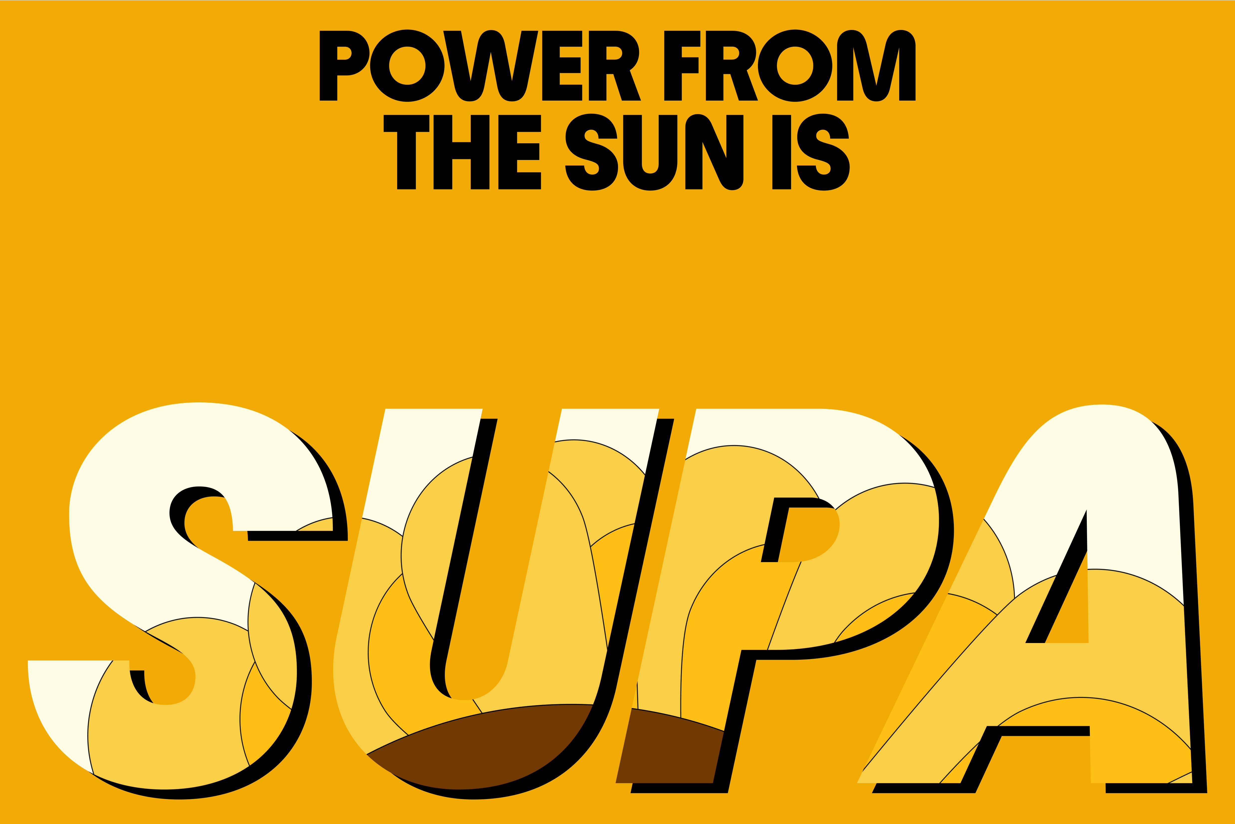
The idea wasn’t just a tagline, it was a strategic decision to embody Supa’s promise at every touchpoint. Visually, we needed to express more than clean power. We had to capture momentum, optimism, and a sense of collective pride. That’s where the sunflower came in. It’s not just a logo. It’s the original power plant. And it’s alive.
Young sunflowers also exhibit heliotropism, a behavior where their flower heads follow the sun's movement across the sky from east to west.
We designed a generative system that gives every Supa user their own sunflower, each one animated to follow the sun. It’s a digital badge of people power. A reminder that energy can be both deeply personal and powerfully communal.
This idea carries across product, storytelling and design. It connects the emotion of community with the utility of decentralised energy. And it’s why Supa stands out: we don’t just talk about good energy; we show it, grow it, and share it.
Supa makes electricity feel personal. Every rooftop install, every AI-optimised watt, every dollar sent back to a school is another hit of Good Energy. We don’t just retail power, we reshape the power system for people.
Supa is a product and a movement. A spark for local pride. A smarter, cleaner, fairer grid built from the ground up.
The Design
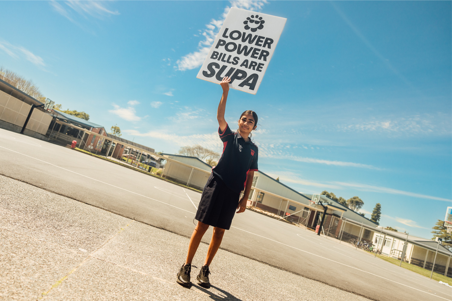
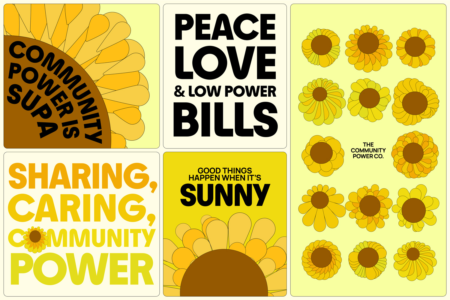
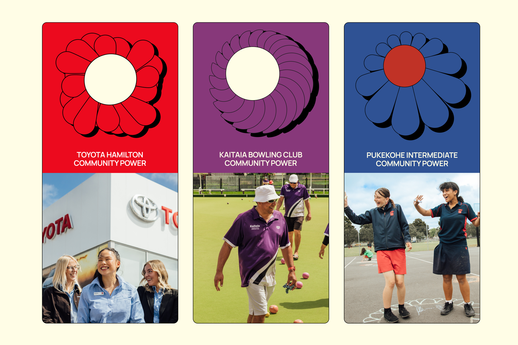
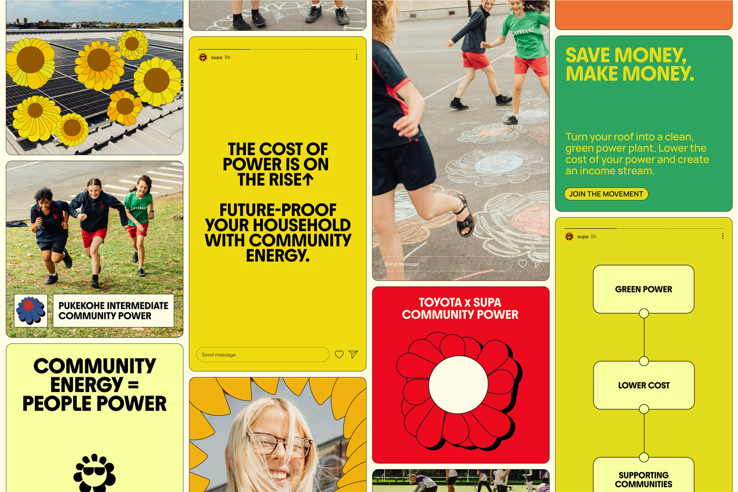
Supa’s design expression radiates positivity, intelligence and approachability. Visually, it leverages solar motifs: bright light, rooftops, beaming kids, hands-on impact. Photography grounds the brand in real New Zealand communities; Pukekoe Intermediate, local bowling clubs and car yard rooftops.
The visual brand is all about the warmth and optimism of solar, without feeling like a stereotypical solar panel company. At its heart is the sunflower mark and a generative sunflower system animated to move with the sun, just like real sunflowers.
Each Supa user receives their own unique sunflower: a joyful symbol of their role in the power ecosystem and a nod to nature’s original power plant. This playful yet meaningful device ties the emotional tone of the brand with its technical mission: to turn sunlight into community good.
Supa’s visuals embody the concept of people power and community energy, capturing the momentum that comes when neighbours, schools, and businesses work together for shared benefit.
The visual identity turns solar into a social signal of unity, participation, and good energy made visible.
Every design decision aimed to manifest the brand’s intent: making energy feel like something you want to be part of.
What Elevates the Work
Supa is more than a new brand; it’s a systems-level intervention. It reimagines how power is made, moved and measured. Its impacts are:
With Supa, energy becomes a community asset, not just a cost. And that’s a powerful, hopeful idea: that something as technical as electricity can be a source of connection, purpose and pride. That’s more than energy. That’s Good Energy.
Sign up for innovation and design news:


.gif)


